

Jan. 24, 2004
A caucus is a closed meeting of equals, the word probably derived from the Algonquin cau-cau-asu, translated as "proponent" or "advisor."
At 6:30 pm on January 19th, Iowa's 1,993 precinct caucuses were called to order, beginning the first step of an elaborate six-month process:
To make things confusing, the Iowa Democratic Party does not release the number of precinct delegates chosen on the 19th. Instead, the party releases a tally of state delegate equivalents, an estimate of the results of the county caucuses that will be held in March.
Although the count of state delegate equivalents is at least two steps removed from the actual votes cast by caucus attendees, the count is about as close as we can get to actual voting data, and deserves some study.
 |
|
| County results | |
| (Redrawn from a map appearing on the Des Moines Register's web site) | |
 |
|
| County results for John Kerry | |
| (Percentage won) | |
Iowa is an interesting state because its 99 counties are all roughly the same size and shape.
Published maps of the Iowa caucus results tend to use a county map marked with different colors for each candidate. For example, the map at right shows the first place finisher in each county, with split fields of color indicating two- and three-way ties. The overall visual impression is of a fairly even statewide split between Kerry (light gray) and Edwards (light red), with Dean (dark red) winning only a small number of counties.
County maps can also be drawn for individual candidates. At lower right, a map of county-by-county results for John Kerry shows the percentage of support he has received from each county. Kerry appears to enjoy broad support across the middle of the state, with strong support along the west and east borders, and weak support in the south.
Although both of these maps display accurate county data, and each county has roughly the same visual weight, there is a catch: the overall impression of each map is accurate only if each county elects an equal number of state delegates.

Guthrie and Polk counties
Guthrie and Polk counties
In other words, with 3,000 state delegate equivalents and 99 counties, displaying state results on a county map of Iowa only works well if every county chooses roughly 30 delegates, or 1% of the state total.
In reality, the number of state delegates elected by each county varies widely. Polk county elects 430 delegates (a full 14% of the state total), while Guthrie county elects only 12 delegates (0.4% of the state total). The two counties have similar surface areas, but a 35-fold difference in their share of state delegates.
The reason for the difference is that state delegates are allocated according to population. Iowa's estimated population in 2001 was just over 2.9 million, and with a population of only 11,323, Guthrie county does indeed represent only 0.4% of the state. Polk county contains the state capital and has a population of 379,029, or 13% of the total state population.

Guthrie and Polk counties
Guthrie and Polk counties scaled in proportion to their number of state delegates
Scaling each county relative to the number of delegates it elects produces a more accurate visual weighting (at right), though Polk county has broken its boundaries relative to the rest of the state, and Guthrie county has shrunk to a fraction of its former size. Although my previous attempts at mapping votes by county in the 2003 California Statewide Special Election scaled counties while maintaining most internal borders, Iowa's gridlike pattern of counties makes it difficult to maintain internal borders without massive distortion. Another method of scaling is needed.
One technique to reduce distortion is to modify the presentation of the county borders. Plotting the midpoint of each county and then drawing connections through shared county borders creates a simple network diagram of counties:

1. Plot county midpoints

2. Connect counties along shared borders

3. Remove county borders

4. Scale counties

5. Remove midpoints
Now when a county scales it has a flexible framework in which to move. Although county size is distorted, the relationships between adjacent counties are preserved.
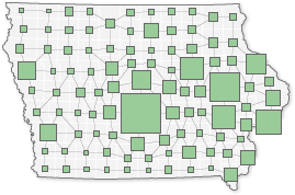
Guthrie and Polk counties
Counties scaled in proportion to their number of state delegates
Scaling all 99 counties in a similar way produces the revised county map of Iowa at right, shown at a scale of roughly 4 green pixels per state delegate (the enlarged map is more accurate, at roughly 25 pixels per delegate). For easier comparison, all counties are drawn as squares.
Although this map is not intended as a display of population, state delegates are distributed in proportion to population, and there is a correlation of about 974 people for every state delegate, or roughly 250 people for every green pixel (about 40 people per pixel in the enlarged map).
One advantage of this presentation is that the relative voting power of each county is made immediately apparent: the bulk of the state delegates are elected by the more populous central and eastern counties.

No scaling, no distortion

Distortion due to county scaling
Another interesting feature of this type of map is that any underlying graphical distortion of the state is made visible by comparing the before and after framework maps.
Redrawn maps for county-by-county results and for John Kerry's individual results are shown at right.
County results

Scaled county results
Although less colorful, the redrawn maps may present a more accurate overall impression of statewide trends.
County results for John Kerry

Scaled county results for John Kerry
Similarly, generating maps for individual candidates can reveal patterns of support not visible in traditional county-by-county maps.
John Kerry: 38%
(1,128 delegates)

John Edwards: 32%
(957 delegates)

Howard Dean: 18%
(540 delegates)

Richard Gephardt: 11%
(318 delegates)

Dennis Kucinich: 1%
(39 delegates)

Wesley Clark: 0.1%
(3 delegates)