

Oct. 9, 2003
County maps can be deceptive, especially for large states like California.
Unless the population of a state is dispersed evenly in proportion to the size of each county, there is no direct relationship between the physical area of a county and the number of people, registered voters, or votes cast within it.
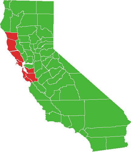
Which is why I was surprised to see an analyst from a leading all-news television network point to a map of California and single out San Bernadino county, California's largest county by area, as a significant reason for Arnold Schwarzenegger's victory.
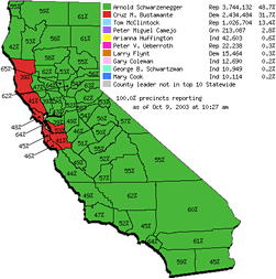
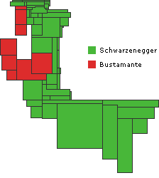
I saw a similar map on the day after the election, a map of leading gubernatorial candidates by county, provided as part of California's official election results and reproduced at right.
The official county map shows at least four things: the location and size of each county (as a surface area), the leading candidate within that county (as a color), and the percentage of votes cast for that candidate (as a number). The map legend adds the statewide totals and the percentage of votes cast for each of the top 10 candidates.
The map is correct in showing that Schwarzenegger won this election, but the map doesn't fit the data very well. The tally of votes gives him 48.6% of the total, but almost all of the map is green. Stretching or condensing data to fit a physical area often results in visual misrepresention or exaggeration, and I was curious to find out how much the county map exaggerates the voting data.
After removing captions, text, and drop shadows, the map shows a total of 86,031 colored pixels.
Of that total, 81,560 pixels (95%) are Schwarzenegger green, and 4,471 pixels (5%) are Bustamante red.
For a side-by-side comparison, we can ignore details of land mass, and simply show the pixels:

Schwarzenegger
(81,560 pixels)

Bustamante
(4,471 pixels)
Measuring the map pixel by pixel, Arnold Schwarzenegger is clearly the leading candidate across almost all of California's land mass, while Cruz Bustamante trails far behind. Now, how closely does this relative measure of surface area match the actual votes cast for each candidate?
According to the map's legend, Schwarzenegger received a total of 3,744,132 votes statewide, while Bustamante received 2,434,484 votes. If we divide by the number of pixels used on the map for each candidate, we find that each green pixel on the official map represents roughly 46 votes cast for Schwarzenegger, while each red pixel represents roughly 545 votes cast for Bustamante. That's a twelve-fold difference in meaning between the two colors; clearly there must be room for improvement.
If we agree on a standard scale of roughly 500 votes per pixel, we can revise the two surface areas to reflect the actual relationship between votes cast for Schwarzenegger (3,744,132 votes = 7,488 pixels) and votes cast for Bustamante (2,434,484 votes = 4,869 pixels). For comparison, we can also add all votes cast for the other 133 candidates (1,506,229 votes = 3,012 pixels).

Schwarzenegger
(7,488 pixels)

Bustamante
(4,869 pixels)

Others
(3,012 pixels)
Now both green and red conform to the same scale, roughly 1:500, and we can judge the relative number of votes accurately (about 49% for Schwarzenegger, 31% for Bustamante, and 20% for others).
Still, this graphic doesn't tell us much, since we've lost all county-specific information.
Now that we have a fixed scale (1 pixel = roughly 500 votes), we can redraw the county map of California to show the actual number of votes cast per county in the 2003 special election:
Number of votes cast by county
(1 pixel = 500 votes)
Original map
(Surface area by county)
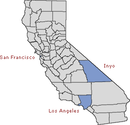
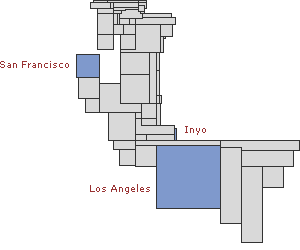
Note that the relative size of each county has shifted dramatically. Densely populated counties like San Francisco (239,789 votes cast) and Los Angeles (1,964,853 votes cast) have jumped in size, while less populated counties like Inyo (5,459 votes cast) have shrunk to a fraction of their physical area.
This redrawing maintains borders between counties wherever possible, but California's dense coastal population means that some of the more open western counties have been pulled apart where they otherwise would be touching.
Adding green or red for the leading candidate reveals a different proportion of votes:
Leading candidate by county
(1 pixel = 500 votes)
Original map
The new map provides a slightly more balanced relative surface area, but it fails to account for the percentage of the vote won by each candidate. The official map writes the actual percentage value within the border of each county, using numbered arrows for the smaller counties.
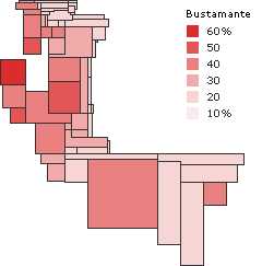
% of votes by county cast for the leading candidate
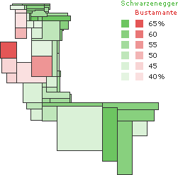
By replacing the combination of flat green, flat red, and numbers with a range of color values, we can show the percentage of each county's total votes that were cast for the leading candidate. Although the values have been rounded to the nearest 5%, this presentation is clearer than trying to read each number on the original map.
Another drawback of both the original and the redrawn county maps is that each map shows only one candidate per county, suppressing all information about the other candidates.
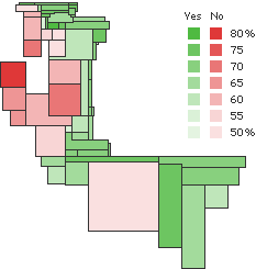
% of votes by county cast for Schwarzenegger or Bustamante
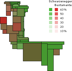
One option would be to overlay two sets of color onto a single map, including data for each of the two front runners.
The resulting map does give some feel for the complexities of the election, but the heavily blended colors do not allow accurate measurement of the percentage values. Indecisive counties just look muddy.
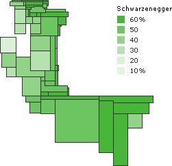
If we show the same data using a separate map for each candidate, a clearer picture emerges:
% of votes by county cast for Schwarzenegger
% of votes by county cast for Bustamante
% of votes by county cast for Gary Coleman
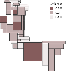
We could go on to show maps for all top ten candidates, as long as we don't dramatically shift the scale of color values.
This deceptive scale shows Gary Coleman apparently taking over Solano, San Francisco, Alameda, and Los Angeles counties.
We can also turn to other results, allowing side-by-side comparisons:
% of votes by county to recall (or not recall) Gov. Gray Davis
% of votes by county cast for Bustamante
% of votes by county to recall (or not recall) Gov. Gray Davis
% of votes by county cast for Schwarzenegger
% of votes by county to recall (or not recall) Gov. Gray Davis
% of votes by county cast for the leading candidate
Voter turnout by county
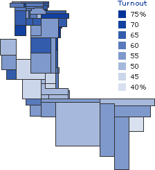
% of votes by county cast for the leading candidate
Different versions of the map might display total population, the number of registered voters (as opposed to just the ones that voted), or the number of votes received for each candidate (the map would contract in a different pattern for each candidate, paler regions shrinking more than darker regions).
Still, it's important to remember that these redrawn maps are only valid for one election, if that. These maps will likely become obsolete tomorrow, and again whenever the number of certified votes changes. For precise readings, it's always best to check the data.
All numbers referencing ballot returns were taken from the California Statewide Special Election Results web site, as provided by the California Secretary of State, on October 8, 2003. Those numbers may change from day to day, and final certified election results may differ. Due to rounding, reduced size, and shared borders, pixel counts for some counties are approximate. Gray border lines on the drawn maps are for separation only, and are not included as part of the county's area.